Instagram is a photo and video-sharing social networking platform that was launched in 2010, and today, the app boasts over 2.4 billion monthly active users. Instagram allows users to upload, edit, and tag photos and videos. In addition to keeping its users up to date on recent happenings in their personal network, Instagram also allows influencers and small businesses to connect, engage with their audience, and even generate sales. Instagram’s carousel feature is particularly useful for showcasing multiple images in one post. It is essentially one swipeable album consisting of up to 10 images or videos that enables users to tell a compelling visual story while creating an engaging and interactive experience.
For this project, I conducted user and comparative research to identify any flaws and possible improvements for the carousel feature. Following this, I saw the opportunity to enhance the feature by including the ability to rearrange and add additional media to an existing carousel post, making it more forgiving of human error and convenient for users.
ROLE
TOOLS
User Research, UX/UI Design,
Data Synthesis, Prototyping
Figma, FigJam, Zoom, Typeform
3 weeks (Jan - Feb 2024)
DURATION
POV STATEMENTS & HMW QUESTIONS
I’d like to explore ways to help Instagram users feel less restricted by the current
edit settings because they may feel that they are unable to share as much content as they would like.
How might we enable users to share their content more organically and
authentically?
I’d like to explore ways to help users fix errors in their content more efficiently
because it is frustrating to reupload their content due to small mistakes.
How might we support users with a more forgiving and efficient solution to fix errors in their post?
To start brainstorming ideas, I wrote out Point of View Statements that helped create How Might We Questions in order to identify opportunities to address user pain points.
Point of View
How Might We...?
WIREFRAMING
To establish the fundamental user interface, I created low and mid-fidelity wireframes. These screens were used in the initial usability testing and helped validate the workflows. Since I am only adding features to an established app, some of the screens are Instagram’s current, existing screens.
I thought carefully about where my features should be located so that they would be a well-integrated and seamless addition to the current product.

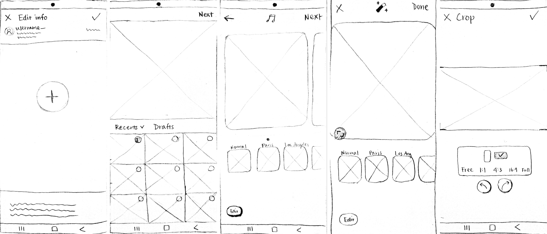
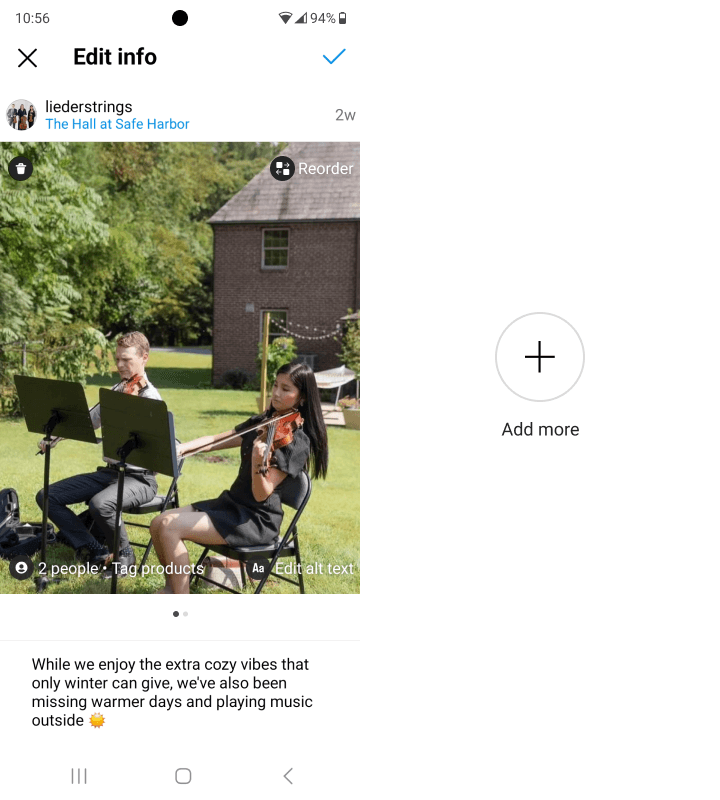
Add photos to an existing post
Rearrange photos in an existing post
Low-Fidelity Wireframes
Pain point:
Users don’t have a way to reorder their photos once the post is published.
Pain point:
Users don’t have a way to add any additional photos once the post
is published.

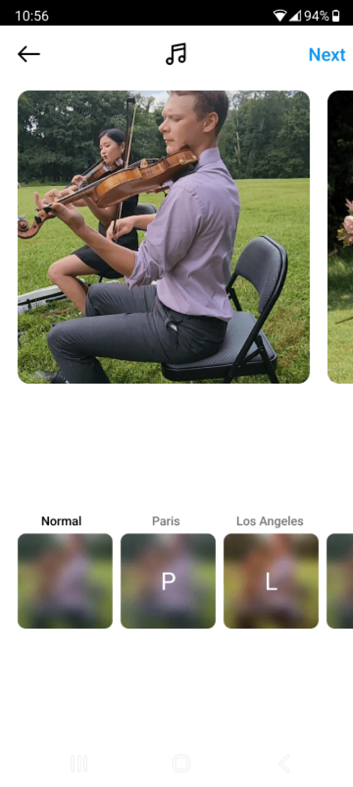
Users now have the option to crop their photos during the editing stage, rather than only at the initial upload. Additionally, users can now choose to crop each of their photos independently and apply different orientation (landscape vs. portrait).

Pain point:
Currently, Instagram only allows users to either maintain the original aspect ratio of their photo or force it into a 1:1 aspect ratio. Users also must make this choice before proceeding with other editing actions. However, when uploading a series of photos, this initial choice applies to all photos, which often results in awkward cropping.


Task 1: Rearrange photos in an existing post
Task 2: a) Adding photos to an existing post
Task 2: b) Cropping each photo individually and applying independent orientation
Existing screen
Existing screen
Edited screen and additional screen
Edited screen and additional screens
Additional screens

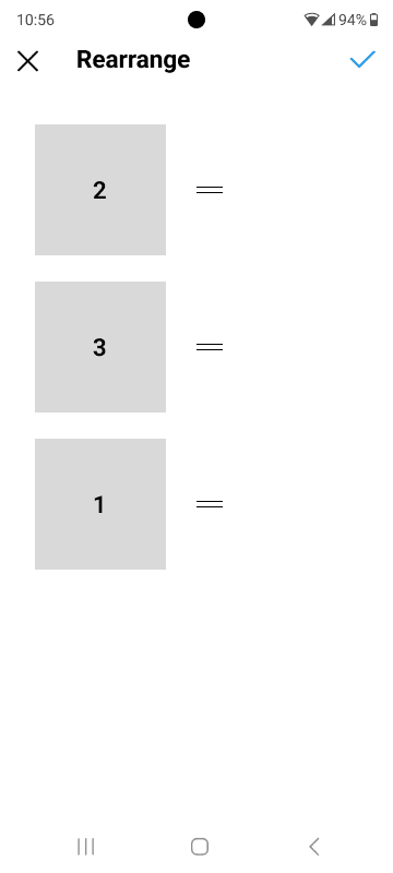
Users can now drag to reorder their photos
The existing screens, shown in color below, are actual screenshots of the app, while the grey scale screens highlight the updates I’ve made.
Mid-Fidelity Wireframes


New Reorder button in the top right corner

Added dots to provide users the affordance to swipe
Users can now add more photos to their post

The photo adding action follows Instagram’s existing UI to make it feel as familiar as possible

Added a cropping icon here

Users can apply a different aspect ratio as well as orientation to each of their photos if they choose to
INITIAL TESTING & RESULTS
Four users between ages 22-59 participated in an initial moderated usability test. The testing procedure involved completing two tasks:
1) Rearranging the order of photos in an existing post, and
2) Adding photos to an existing post and cropping the photos
Based on user feedback, the following change was made to the design in high fidelity:
All four users navigated the screens successfully and completed the tasks without major issues.
On average, users spent 28 seconds on task one and 2 minutes and 4 seconds on the task two.
Users expressed that the tasks seemed straightforward and that they’ve had a positive user experience with the added features. Users demonstrated overall adaptability with the added
features and remarked on their seamlessness, noting that the features felt native to the app.
Results
Problem
Improvement
Users noted that the two lines in the rearrange screen were not immediately recognizable as indicating a "drag" action.
To address this, a brief caption was added at the top of the screen to inform users that they can drag the photos to reorder them.
PROBLEM
Instagram currently does not provide a feature to rearrange images once a post is published. It is also not possible to add photos to a carousel post after it’s published. Instead, Instagram only allows the user to delete photos from a carousel post. I realized there is an opportunity to improve the way users fix errors in their content after it’s published.
Deleting and reuploading content due to small mistakes is tedious and inefficient for users


©2024 Dorothy Chung
USER RESEARCH
I outlined a research plan with the following objectives to help kickstart my research. The research plan included a competitive analysis, user interviews, and a survey.
Learn and understand the current user experience on Instagram
Learn and understand the current user experience on the carousel feature
Identify the user needs and pain points that users encounter when using carousel feature
Learn if there are frustrations related to Instagram and the carousel function
Research Objectives
I conducted a competitive analysis to compare several photo-sharing apps that are currently available on the market and assessed their strengths and weaknesses.
Competitive Analysis

Although Instagram boasts many unique features that differentiate it from its competitors and establish it as the leading photo-sharing app, the competitor analysis revealed two areas where Instagram lags behind:
1) Free, unrestricted photo cropping
2) The ability to reorder photos after publishing


Unlimited number of photos per post
Free, unrestricted cropping
Ability to edit photos after publishing
Ability to reorder photos after publishing
Comprehensive photo editing tools
With this in mind, I saw an opportunity to enhance Instagram by incorporating these features. However, I still wanted to keep the opportunities for features open as I moved into the survey and user interview phase.
I created an online survey to gain a deeper understanding of user behavior on Instagram, specifically focusing on their habits related to carousel posts. This survey gathered further qualitative and quantitative insights on users' engagement with carousel posts and tested demand for a new feature to enhance the carousel function on Instagram.
The survey collected responses from nine users, ranging in age from 22 to 59. Here are some of the key insights:
User Survey
78%
of users use Instagram every day
100%
of users have made carousel posts before
89%
of users make carousel posts regularly
67%
of users post carousel posts at least several times a month
100%
of users who have a business account with Instagram post carousel posts regularly
I conducted 45-minute user interviews with five participants between the ages of 22 and 59 who are active Instagram users and familiar with the carousel function.
In conducting user interviews, I aimed to validate my hypothesis by exploring how users interact with Instagram’s current features and identifying any gaps in their experience. I focused on uncovering specific pain points and frustrations users encounter during content creation and sharing, seeking to understand how these issues affect their overall satisfaction. This deep dive helped me determine whether the proposed features would address these challenges effectively and guide the next steps in refining the design.
I gathered quotes from the interviews and organized the data into an affinity map, which helped identify key recurring themes and allowed me to understand the trend of user experiences with Instagram. With this synthesized data, I was able to visualize potential solutions to help alleviate the pain points and meet user needs.
User Interviews
1
Users enjoy the carousel function because it adds interest and helps with user engagement
Users mentioned that they favor the carousel function because it allows users to spend more time on the posts, thereby encouraging more interactions.
2
Users do their best to check their post before publishing to ensure there are no errors
Users reported that they spend time on determining the order of their photos before creating a post, as Instagram does not allow reordering once the post
is published.
3
There is no real solution to fix a mistake in a post after publishing
Users expressed their frustrations upon discovering a mistake in their post after it’s already been published. The frustration stems from knowing that their only option to salvage the post is to either ignore the mistake or
delete and repost, and risk losing all the engagement they’ve already
received thus far.
4
Users are frustrated with Instagram’s forced cropping
Users expressed concerns that Instagram’s current cropping function isn’t intuitive and forces the user to apply the same orientation and aspect ratio across all the photos within a carousel post. This results in awkwardly cropped photos, which negatively impacts the user experience.
Key Research Findings
I mapped out the user journey to better empathize with the users. Through this process, I identified an opportunity to minimize the negative emotions associated with discovering mistakes in a post
after publishing.
Journey Map

With the findings gathered from my research, I developed two personas who share the same user needs and pain points with the Instagram users I interviewed.
User Personas

Sophia “The Innocent”
Background
Age
34 years old
Location
Boston, MA
Account Type
Personal
Occupation
Senior UX Designer
User Needs & Goals
User Pain Points & Frustrations
Sophia is a senior UX designer and has been an Instagram user for 11 years. She is an avid world traveler and foodie, and loves to share pictures from her trip with her friends and family.
Sophia loves taking landscape photos of the places or sceneries she has visited, but she also loves sharing photos of the food she tried on the trip. She also wishes that she could post more pictures or clips in one carousel.
Needs to have a way to display both landscape and portrait photos in the same post
Needs to figure out a way to comfortably crop all her photos without awkward cutoffs
Wishes she could feature more than 10 photos per post to show more content from her trips
She hates that Instagram’s current carousel settings force her to have only one type of orientation for the entire post, despite her pictures being all different and unique
She is frustrated with the cropping settings, and wishes sometimes she can just nicely preserve a photo without the awkward cropping

“I want to share more of my exciting adventures with my network. I wish there’s a more authentic way for me to show memories from my trips! “

Danielle “The Hero”
Background
Age
30 years old
Location
Baltimore, MD
Account Type
Professional
Occupation
Small Business Owner
User Needs & Goals
User Pain Points & Frustrations
Danielle owns a luxury flower design business and her Instagram account has recently started gaining a fairly large following. Danielle has worked hard to establish herself as one of the best floral designers in the area.
Danielle uses her Instagram account to showcase her work and share client testimonials as well as industry tips and tricks. She regularly engages with her followers, and she often meets potential clients as well as other local florists through the platform.
Danielle keeps her account very active, and with that, she inevitably makes mistakes in her posts sometimes. She tries her best to catch them before posting, but she’s human—and sometimes the mistakes are only caught after the post has already been published.
When she realizes there is a typo in the one of her images (which are often infographics as they are more eye-catching to her audience), she needs a quick way to re-upload the photo without removing the post
If there is a mistake in the order of her images, there should be a way to easily rearrange the pictures in her post after it’s been published
If she forgets a picture in the sequence, she needs an easy way to add it after the post has been published
She doesn’t like deleting and re-uploading her entire post because she loses all the initial engagement from her followers
If there is a typo in her infographics post, she also doesn’t want to just leave it up because she worries that her followers will find her unprofessional

“Creating content for my business account is hard work! I try my best to bring engaging, relevant content to my followers, and I want to maintain a professional image. I wish there is a more forgiving and efficient way to fix errors in my posts.”
POV STATEMENTS & HMW QUESTIONS
The journey map, along with the user personas, provided crucial insights into the user experience, allowing me to pinpoint the main problem areas more effectively. By visualizing the user's journey and understanding their motivations and pain points, I was able to identify specific moments of friction and frustration.
This informed the development of clearer and more targeted POV statements and HMW questions, ensuring that the proposed solutions were directly aligned with the users' needs and addressed the core issues at hand.
I’d like to explore ways to help Instagram users feel less restricted by the current
edit settings because they may feel that they are unable to share as much content as they would like.
How might we enable users to share their content more organically and
authentically?
I’d like to explore ways to help users fix errors in their content more efficiently
because it is frustrating to reupload their content due to small mistakes.
How might we support users with a more forgiving and efficient solution to fix errors in their post?
Point of View
How Might We...?
INFORMATION ARCHITECTURE
Task Flows & User Flows
To help define the structure, task flows and user flows were mapped out to model logical sequences of what the user experience would be like. The main task flows that I focused on building were:
1) Rearranging photos in an existing post, where the user can edit a post to readjust the order of
the photos
2) Adding photos to an existing post, where the user can add additional photos to a post that has already been published.

Task Flows
Click image to enlarge

User Flows
Click image to enlarge
PROTOTYPING
High-Fidelity Wireframes
Following the initial usability test, colors and final details were added to the mid-fidelity wireframes to create high-fidelity wireframes. A brief caption was added to the rearrange screen per the feedback from the initial user testing.
Before
After

93%
successful completion rate among users
33%
misstep rate among users
25s
was the average time to complete Task 1
1m 11s
was the average time to complete Task 2
100%
of users found the features to be useful
100%
of users said the features felt native
Results
USABILITY TESTING
High-Fidelity Testing
I conducted an unmoderated usability test with six active Instagram users between ages 22-59 to validate my designs. Feedback from the test helped me make informed decisions on what areas needed improvement. Users were asked to complete the same two tasks in the initial testing:
1) rearranging the order of the photos in an existing photo, and 2) adding photos to an existing post and cropping the photos.
3
Having an editing icon on the image would be helpful
50% of users suggested adding some type of indication somewhere on the screen that follows immediately after pictures are added, so they know they can click into the picture to crop and edit that photo.
Feedback and Insights
The participants in usability testing provided valuable feedback to improve both features.
The following suggestions will be implemented to the design:
1
Photos in the rearrange screen should be displayed in a grid-like manner
67% of users expressed concerns that although the current vertical layout is simple and straightforward, the empty space to the right of the photos seems awkward and wasteful;
they wish to see a better layout that fills the screen more.
2
The rearranging feature should be more animated and engaging
Two users suggested incorporating an animation when pressing and holding on an image to indicate that it is movable.
Iterations
Following the conclusion of the usability testing, the above user feedback was used to refine the final product. The specific changes and a comparison of the before and after are detailed below:
Before
After Iterations

Photos are now arranged to optimize the use of the entire screen
Before
After Iterations

An editing pencil icon has been added to the top right of each image, so users know that they can click on each picture to crop and edit individually
Before
After Iterations
When users press and hold on an image they wish to rearrange, the image will tilt, indicating that it is ready to be moved


REFLECTION
Final Thoughts
This project taught me how to integrate new features within an existing design system. Initially,
I assumed this would be a straightforward task; however, it presented its own unique challenges and constraints. Nonetheless, I believe I successfully created two additional user-friendly and functional features for the Instagram app.
I thoroughly enjoyed prototyping the final product; it was exhilarating to see it come together and look like an integral part of Instagram. Additionally, it was rewarding to hear that users would consider using the features in real life.