
Instrurent
Instrurent is an end-to-end app designed to connect musicians within their local communities by facilitating peer-to-peer instrument rentals. The name "Instrurent" is derived from combining "instrument" and "rent," reflecting its purpose as a rental app for musical instruments.
Whether a violin is needed for a weekend performance or a keyboard for a recording session, Instrurent offers a seamless and convenient way to access a variety of instruments. The platform allows musicians to share their instruments, earning extra income while fostering a collaborative musical environment. The concept envisions creating a vibrant network of instrument sharing for musicians of all levels.
ROLE
TOOLS
UX/UI Design, User Research, Data Synthesis, Usability Testing, Branding, Prototyping
Figma, FigJam, Zoom, Typeform
6 weeks (May - June 2024)
DURATION
PROBLEM
While it is great and even necessary that many instrument retailers work closely with schools, as many students begin their musical journey there, there is a noticeable lack of options for adults who want to try out a new instrument or pick up an old instrument. Adults who are not affiliated with a school might feel discouraged from renting an instrument.
As a UX/UI designer, I saw an opportunity to create an app that allows the average adult to rent instruments for the short term or long term, independently, without the constraints of a school semester plan. Furthermore, I believe there is an opportunity to have an app where music-loving adults, professionals or hobbyists alike, can rent instruments from one another within their
local community.
There are limited rental options available for adults outside of school settings who wish to explore a new instrument or revive an old skill.


BACKGROUND
Some of the leading companies in the musical instrument rental service market are Music & Arts, which is a subsidiary of Guitar Center, Menchey Music, Yamaha Music, and Sweetwater. Notably, Music & Arts, established in 1952 and operating 253 retail locations across the U.S., is perhaps the most well-known and has been renting instruments since its inception. With so many years of experience, one could almost say that Music & Arts has nearly perfected the art of musical
instrument rentals.
From big instrument retailers to local, privately owned music stores, there are countless places offering instrument rental programs. These programs have made rental instruments easily accessible and have streamlined the renting process. A common feature of many established rental programs is their connection to the local school system, with many geared towards students currently enrolled
in school.
USER RESEARCH
I outlined a research plan with the following objectives to initiate my research. The research plan included conducting a competitive analysis, interviewing users, and synthesizing data gathered from those interviews.
Explore the current landscape of instrument rental services and platforms, identifying gaps and areas for improvement in user experience, accessibility, and community engagement.
Investigate the motivations and barriers for musicians interested in renting instruments peer-to-peer within their local community.
Explore what users look for when renting an instrument.
Research Objectives
To understand the landscape of musical instrument rental services, I conducted a competitive analysis that included both direct and indirect competitors. The direct competitors—Music & Arts, Sweetwater, and RentMyInstrument—were analyzed alongside FriendswithA, an indirect competitor. FriendswithA is a community gear-sharing platform that doesn't specialize in musical instruments but provided valuable insights into peer-to-peer rentals.
This analysis revealed significant gaps in existing platforms, notably the lack of short-term rental options (under 30 days) and the limited availability of non-student-grade instruments. These insights informed my design approach, focusing on addressing these unmet needs.
Competitive Analysis
Daily rental prices available
Same-day pick-up
Professional-grade instruments
Insurance/Protection plan
Rent-to-own options
Allow users to be lenders and create listings
Music & Arts
Sweetwater
RentMyInstrument
FriendswithA
To take a deeper look at where each competitor is doing well and where are their areas for improvement, I compared their strengths and weaknesses:
Music & Arts
Offers a 30-day trial; customer can return the instrument for a full refund.
In-store rental instruments available.
Offers private lessons as well.
Partners with 20,000 schools.
Free shipping on most items, not all.
The shortest rental period is a month.
Shipping is a little slower; it takes 2-7 business days.
Sweetwater
Strong relationships with vendors and manufacturers for exclusive products and deals.
Instrument Protection Plan replaces the instrument in the case of loss or theft.
Been a trusted retailer in the music industry for over 40 years.
They only have student and intermediate level instruments to choose from.
Instruments ship out in 1-2 business days, so the user cannot start playing on the same day they make their rental order.
RentMyInstrument
Has a guide for musical instrument skill level, which is helpful to the renter.
Users can upgrade to a higher level instrument with free shipping.
Offers rent to own option; all rental payments contribute to the ownership of your instrument.
There is also an early purchase option available/ If you so choose, at anytime during your rental agreement, you may purchase your instrument early and save 50% off the remaining balance.
The shortest rental period is a month.
Only have delivery available and no pick-up option, which means the user has to wait at least 2-3 business days to receive their instrument.
FriendsWithA
Can rent for a short period, as short as a day.
Provides instant property coverage and liability guarantee.
Users are either verified before they can borrow gear or they have to place a security deposit.
If you need help choosing the price for your listing, they have tools to help find the best price.
Does not offer rent-to-own options.
As a renter, you might have to find accessories on your own.
While they have a lot of great, functional and necessary features, and everything is relatively easy to find, the rental process could be even more simplified.
To gain a deeper understanding of the users' needs and experiences with musical instrument rentals, I conducted 45-minute user interviews with five musicians aged 28 to 55. The purpose of these interviews was to explore their perspectives on both renting instruments and renting out their own, including any associated risks and reservations. These sessions allowed me to ask follow-up questions and enabled participants to elaborate on their responses, providing deeper insights into their experiences and concerns. To organize the main insights from the user interviews, I created an affinity map as my next step.
User Interviews
Sample Interview Questions
How do you envision the rental process working in a music instrument rental app?
What factors would influence your decision to use a music instrument rental app regularly?
For the renter:
What concerns or reservations do you have about renting musical instruments from other individuals?
What pricing model do you think would be fair and attractive for renting musical instruments through an app?
For the owner:
Have you ever let anyone borrow or rent your instrument before? What was your experience like?
What concerns do you have about renting out your instruments to strangers? How would you address these concerns?
1
Reviews and ratings should apply to both renters and owners alike
Users consider a rating and review system essential for both renters and owners. Having a review system for both parties ensures fairness and transparency, fostering trust between renters and owners.
2
Users deem secure payment extremely important
Users emphasized that secure payment must be a non-negotiable feature for the app, stating they would not consider using it if it were not available.
3
A daily rate pricing model would be most fair
When asked about the most fair pricing model for a musical instrument rental app, all users agreed that a daily rate would be the most suitable. This pricing structure allows renters the flexibility to opt for short-term rentals.
4
Most users are interested in making extra money by listing
their instrument(s)
Users were intrigued by the option to have an owner account on this musical instrument rental app. The opportunity to earn money from instruments they don't regularly use anymore greatly appealed to them.
Major Research Findings
Following the user interviews, I extracted and organized quotes into an affinity map to identify recurring patterns and key themes. This analysis helped me understand user experience trends and visualize potential solutions to alleviate their pain points. Below is a summary of my findings:
Megan ”The Magician”
Background
Age
24 years old
Location
Los Angeles, CA
Account Type
Renter
Occupation
Freelance Musician &
Multi-Instrumentalist
Needs
Goals
Frustrations
Pain Points
Megan is a talented multi-instrumentalist and vocalist, and her three main instruments are cello, piano, and acoustic guitar. She often accompanies herself on these instruments while she sings.
She now works as a freelance musician under a event music agency. The agency books shows all across the country and she travels often for these gigs. Traveling with all her instruments is cumbersome.
In the past, she’s had to purchase a separate ticket for her cello if she wanted to ensure that it would be gingerly handled. Megan is interested in learning some options that would make her frequent traveling easier.
Needs a way to simplify her trips
Needs to protect her instruments
Needs to reduce her traveling expenses
She has to only get direct flights
Would like to travel lighter
Would love to have an ease of mind and not be so worried about her instruments getting damaged in the process
Carrying all her instruments is tiring
She is frustrated with having to purchase extra tickets for her instruments
She is also frustrated with having to add extra travel insurance on her instruments
There’s always a risk that her instruments could be damaged while traveling
Renting from local stores hasn’t been an option so far because they don’t offer one-day rentals

“I would love to know some ways that would simplify my life as freelance musician who travels so frequently for gigs and shows. Flying with my instruments everywhere is tiring and very stressful.“
DEFINING THE USER
I developed two personas based on insights gathered from the user interviews. Megan, a traveling gig musician in her twenties, seeks a solution to simplify her frequent trips. Ben, a music teacher in his thirties, explores avenues for earning extra income. These personas encapsulate the common needs and pain points identified among interview participants
User Personas
Ben “The Sage”
Background
Age
32 years old
Location
Manhattan, NY
Account Type
Owner
Occupation
Private Violin Teacher
Ben plays the violin and teaches violin privately. Over the years he has accumulated a couple secondary instruments: his violin from his high school years, and his electric violin that he doesn’t play much anymore.
Back in college, Ben used to play gigs on his electric violin with several friends. But now that he has a full studio of 23 students, he’s been solely focused on private teaching. He’s also thinking of offering group lessons soon.
Ben wonders what he should do with his two extra violins that just sit in his studio and take up space. He doesn’t want to sell them as both are great quality instruments and hold a lot of sentimental value to him.

“I have several instruments just sitting in my home studio. I’m not sure what I should do with them - I’m trying to declutter my studio now that I’m private teaching full-time, but I also don’t want to sell them because they mean a lot to me. I would like to have some options.”
Needs
Goals
Frustrations
Pain Point
Needs to declutter his home studio
Needs to maintain ownership of his instruments
Needs his instruments protected and stay in good condition
Would like some options for what to do with his unused instruments
Would like to make some passive income if possible
Is considering possibly letting family, trusted friends and students borrow his instruments
His home studio feels too crowded for private teaching, plus he is contemplating on starting group lessons
He doesn’t like seeing his unused instruments sitting there, taking up space and collecting dust
He doesn’t want to sell his instruments since they hold sentimental value
POV STATEMENTS & HMW QUESTIONS
With the user personas, their needs, and pain points in mind, I developed Point of View statements and How Might We questions to identify potential solutions. After careful evaluation, I selected the most relevant Point of View statement and How Might We question, highlighted below, as they best defined the user problem.
I would like to explore ways to help musicians connect and collaborate through shared access to a wide range of musical instruments.
How might we foster a collaborative environment where musicians can easily access and share a variety of instruments within their local community?
I would like to explore ways to simplify the process for musicians of all levels to access high-quality instruments whenever they need them.
How might we streamline the process for musicians to easily rent high-quality instruments on-demand, tailored to their specific needs and preferences?
Point of View
How Might We...?
INFORMATION ARCHITECTURE
Site Mapping
Keeping the prioritized features and user persona goals in mind, I created a basic site map to visualize the necessary screens and better understand the overall structure of the app.

Task Flows & User Flows
After completing the site map, I developed task flows and user flows to outline the logical sequences of the user experience. The main task flows I focused on were:
Looking up an instrument to rent, and
Listing an instrument

Task Flows
Click image to enlarge

User Flows
Click image to enlarge
Prioritized Features
Next, I brainstormed potential features for the app and prioritized them into three categories:
must-haves for a successful launch, nice-to-haves if time permits, and future enhancements for
later updates.
The must-have features for the app are inspired and supported by the results of user interviews and competitive analysis. The features are detailed below along with their descriptions:

Home
Default home page; displays nearby listings, popular searches, and categories
Popular Searches
Listings that users repeatedly search for
Log In/Sign Up
User can log in to their account, or sign up if they don’t have an account
Search Input
Search input that allows users to look up instruments by name, category, location, etc.
Dashboard
For users to keep track of their bookings and any listings they've favorited
Profile
Where users can keep their payment info, write a short “about me”, etc.
Reviews and Ratings
Ratings and reviews for both lenders and renters
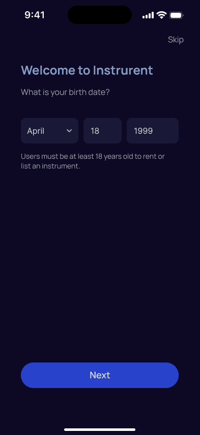
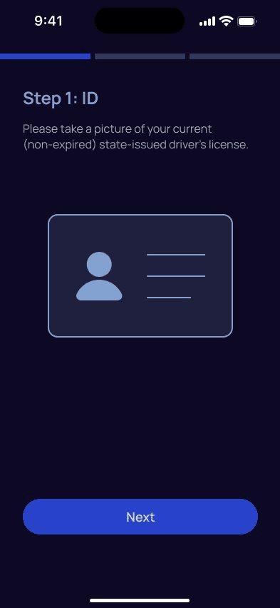
User ID Verification
Every user's identification (phone number, email, etc.) will be verified when they sign up
Availability Calendar
On each listing, there should be a calendar that tracks when the instrument is available for renting
Location Input
Users should be able to see instruments near their location or zip code
Messaging
Renters should be able to directly message lenders if they have questions about their instrument
Instrument Insurance
Instrument insurance (partner insurance) should be available for purchase for both sides
Liability Coverage
Damage Protection of up to $10,000 USD to protect against lost, stolen, or damaged items
Secure Transactions
All payments on the platform should be secured
24/7 Customer Support
Excellent customer support (phone and email) to help users with any issues that may arise
WIREFRAMING
To establish the fundamental user interface, I created low and mid-fidelity wireframes. The mid-fidelity screens were used in the initial usability testing to help validate the workflows and ensure the design structure was solid before incorporating visual and branding elements.
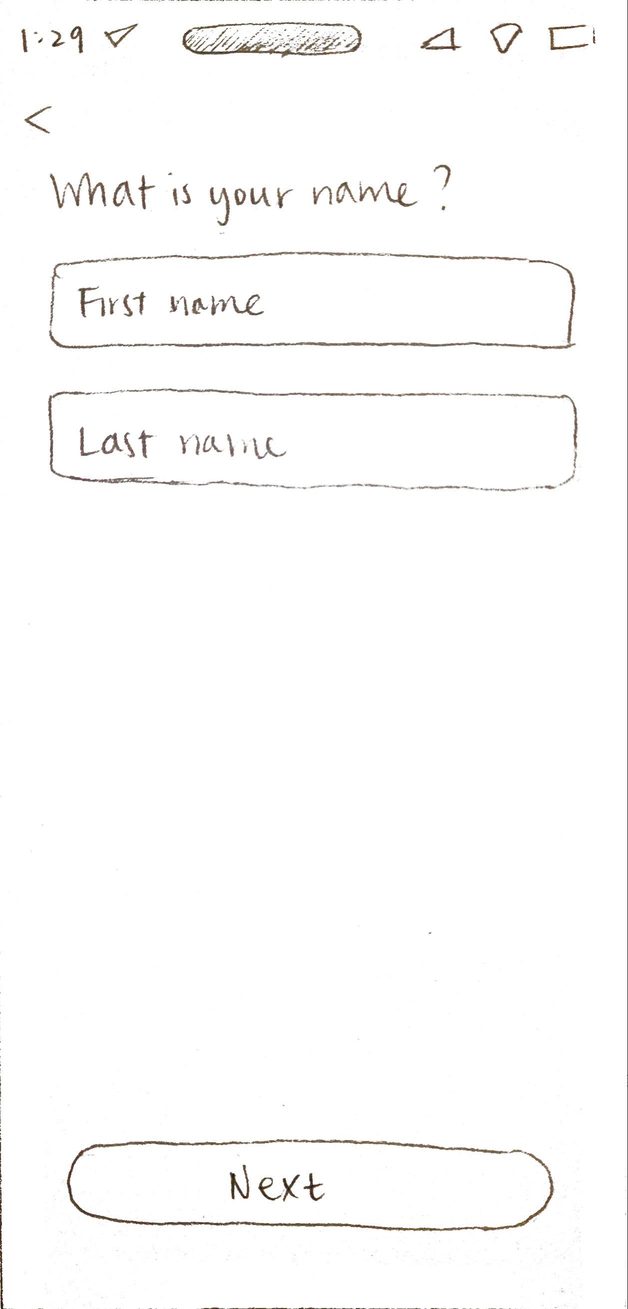
Create an account/Log in
Welcome

Log in

Create account


Rent an instrument
Home

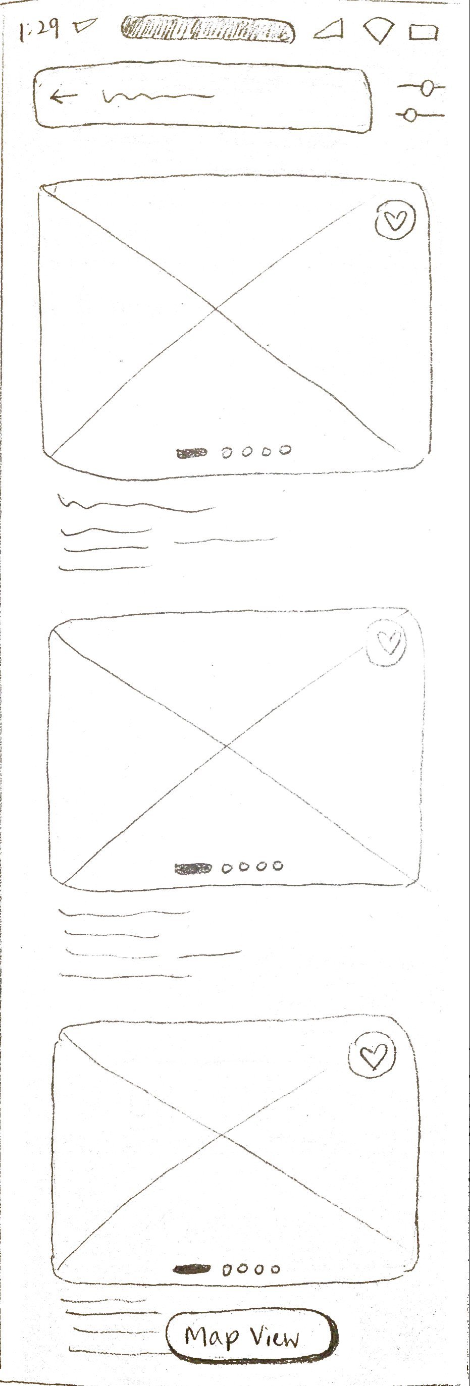
Search


Search results
Listing


Choose dates

Checkout


ID Verification


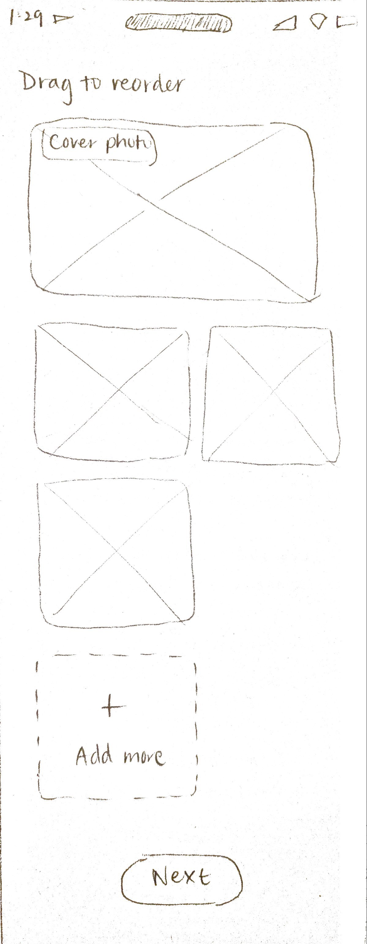
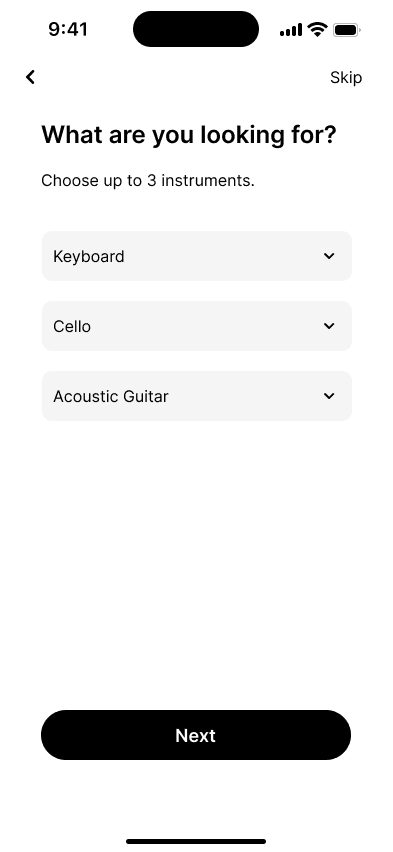
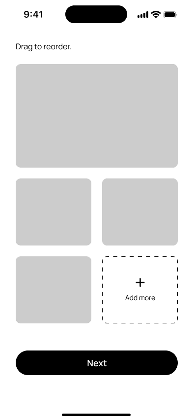
List an instrument
Dashboard

New listing


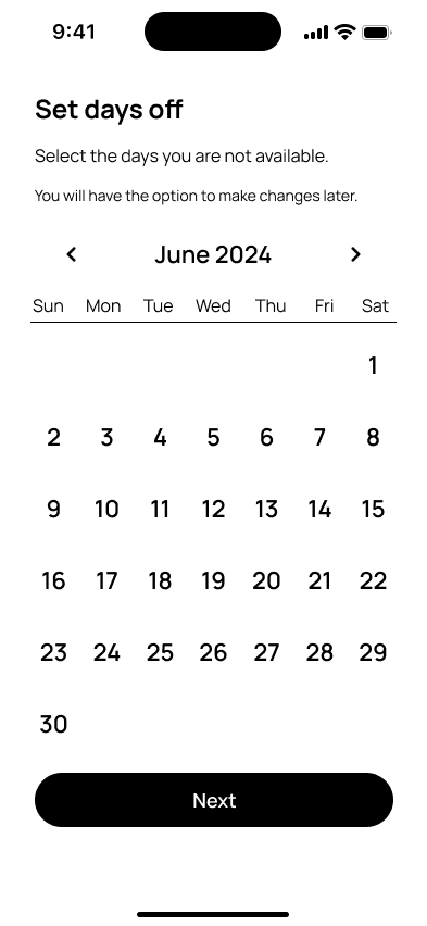
Set availability


Insurance

Low-Fidelity Wireframes
Create an account/Log in
Welcome

Log in

Create account


Rent an instrument
Home

Search


Search results

Listing

Choose dates

Checkout

ID Verification


List an instrument
Dashboard

New listing


Set availability

Insurance

Mid-Fidelity Wireframes
INITIAL TESTING & FEEDBACK
Five musicians fitting the user persona criteria participated in the mid-fidelity user testing. This helped gather initial feedback on the app’s layout and structure, as well as evaluate the users' ability to complete tasks without errors. Participants were asked to perform three tasks representing the app’s main functions:
Look up an instrument
Book a rental
List an instrument
Initially, tasks 1 and 2 were just part of one large task—rent an instrument—but I ultimately decided to separate them for better clarity.
All five users successfully completed the tasks and navigated the app without major issues. They found the tasks straight-forward and easy to complete, reporting an overall positive user experience with an average satisfaction score of 4.83 out of 5. Most users also enjoyed the app's layout and found the structure clear and easy to use. Users spent an average of 52 seconds on task one, 1 minute 22 seconds on task two, and 1 minute 20 seconds on task three.
Results & Feedback
While users had few suggestions for changes to the app, several users mentioned that the search bar on the home screen did not stand out as much as they expected:
Participant 1

Participant 2
Maybe instead of just having “search” as your hint word, include something like “search an instrument” in the search bar.
Based on feedback from the initial usability test, a small iteration was made. The search bar on the home screen now includes the hint text “Search an instrument”, instead of just “Search”, to enhance its visibility. This adjustment ensures that the search bar stands out more prominently, reducing the likelihood of users overlooking it.
Improvement
Original

Improved

BRANDING
Defining The Brand
Next, it’s time to define the brand. I started the branding process with a list of values that would align well with the brand’s image and goals, keeping user needs in mind. The following values emerged: trustworthy, safe, sociable, modern, sophisticated, and efficient. To visualize and generate a cohesive brand, I collected inspiration images to create a mood board.
The primary color palette features blue to emphasize trustworthiness as one of the app’s main attributes. Additionally, since only users above 18 can rent and list instruments, I chose a dark mode aesthetic to further convey a sense of sophistication and modernity.
The name “Instrurent” came from the words "instrument" and "rent," which fits its purpose as a rental app for musical instruments. For the logo, I opted for a combination mark, which includes both a wordmark and a symbol, for versatility and adaptability. The wordmark simply features the word "Instrurent," with "rent" bolded to create visual separation and emphasize the app's rental function. The symbol combines the lowercase letters “i” and “r” from Instrurent, with a note head attached at the bottom to form a music note, reinforcing the musical instrument rental theme. Coincidentally, the combined "i" and "r" also resemble a person facing right and extending their arm, symbolizing the platform's aim to foster community and promote social interactions among users.
Brand Name & Logo Design
As for typography, the Manrope font was chosen for several qualities that make it stand out as a versatile and modern option. This font has a clean, minimal, and semi-condensed style that embraces simplicity and coherence. Its wide range of weights, from light to bold, allows for self-pairing and the creation of a clear typographic hierarchy. This helps produce clean, modern layouts that subtly differentiate between elements without the need for contrasting typefaces. Additionally, Manrope's ideal x-height ensures high readability.
Typography

Click image to enlarge
Designing the icons for the app was mostly straightforward. My goal was to uphold the brand’s clean, modern aesthetic, which I translated into the icon design using simple and clean lines. The most challenging icon to create was the Dashboard. I struggled to develop a design that clearly communicated ‘dashboard’ without becoming too busy or complex. I wanted to avoid elements that might suggest bars and statistics, as this dashboard focuses solely on managing user bookings and listings. After several iterations, I settled on a design featuring four boxes, which more accurately represents the dashboard in this app. This design is simple, effective, and scales well when sized smaller. As for the other icons, I opted for familiar and standard designs to ensure ease of use and affordance for the users.
Icons
Browse
Dashboard
Messages
Profile
PROTOTYPING
High-Fidelity Wireframes
After branding was defined, I incorporated visual elements such as the color palette, typography, logo, and icons, into the high-fidelity wireframes and then conducted a second round of moderated usability testing.


Create an account/Log in


Look up an instrument


Book a rental


List an instrument


View Messages
USABILITY TESTING
High-Fidelity Testing
I conducted a moderated high-fidelity usability test with six musicians who matched the user persona criteria, including some participants from the mid-fidelity testing phase. The users were asked to complete the same three tasks as in the mid-fidelity testing:
Look up an instrument
Book a rental
List an instrument
94%
successful completion rate among users
35s
was the average time to complete Task 1
57s
was the average time to complete Task 2
1m 3s
was the average time to complete Task 3
Success Metrics & Results
Time spent on each task, ease of navigation, user satisfaction, and the number of errors or missteps were some of the metrics used to measure testing success. Users were asked to rate their experience and the intuitiveness of the tasks on a scale of 1 to 5. Below is a summary of the testing results:
Feedback Prioritization
All participants responded positively to the prototype, praising its ease of use and clean, non-distracting design. While there were no major issues with the tasks, users provided some valuable insights for enhancing the design. These insights were categorized into two groups: implement now versus later. This prioritization allowed me to make informed iterations to the final design and effectively address user feedback.
Insight 1: Users are worried that their photo will be saved and shared with third parties.
Participant 1

Participant 3

Participant 2
I haven’t seen people taking pictures of myself to verify. Most of the 2-step verifications I’ve done before are just an extra code sent to my phone or something. You might want to check whether users are comfortable with this.
Insight 2: Users suggest making Dashboard accessible through Profile as well.
Participant 1

Participant 2
You might want to consider making Dashboard findable and clickable in Profile too, if possible, because some people might intuitively go there to set up a listing and you want to allow them a way to come back here.
After careful consideration, I decided to directly implement Insight 1 into the final design, while Insight 2 will be incorporated at a later stage.
A disclaimer is now added to the photo verification screen to let the users know that their photo will not be misused or shared with any other third parties.
Final Iterations
Original

Improved

REFLECTION
Final Thoughts
Designing Instrurent has been an incredibly rewarding experience. I thoroughly enjoyed creating an end-to-end app that users responded positively to; their feedback validated the time and effort I invested in understanding their needs and goals. One of the highlights of this project was designing in dark mode for the first time. This challenge allowed me to learn more about best practices for dark mode design, such as implementing elevation and desaturating colors to create a visually appealing and user-friendly interface.
Additionally, it was exciting to integrate a social and community component into the app, enabling users to connect with each other for rentals. Throughout the development of Instrurent, I felt equally challenged and rewarded, and I am proud of the end result. As a musician myself, it’s gratifying to advocate for musicians and see a project come to life that not only meets practical needs but also encourages social interaction and community building.

©2024 Dorothy Chung